Introduction
As digital products grow, maintaining consistent interfaces becomes increasingly difficult. Different teams may create slightly different buttons, navigation patterns, colors, and form components.
These inconsistencies affect usability, accessibility, development speed, and brand identity.
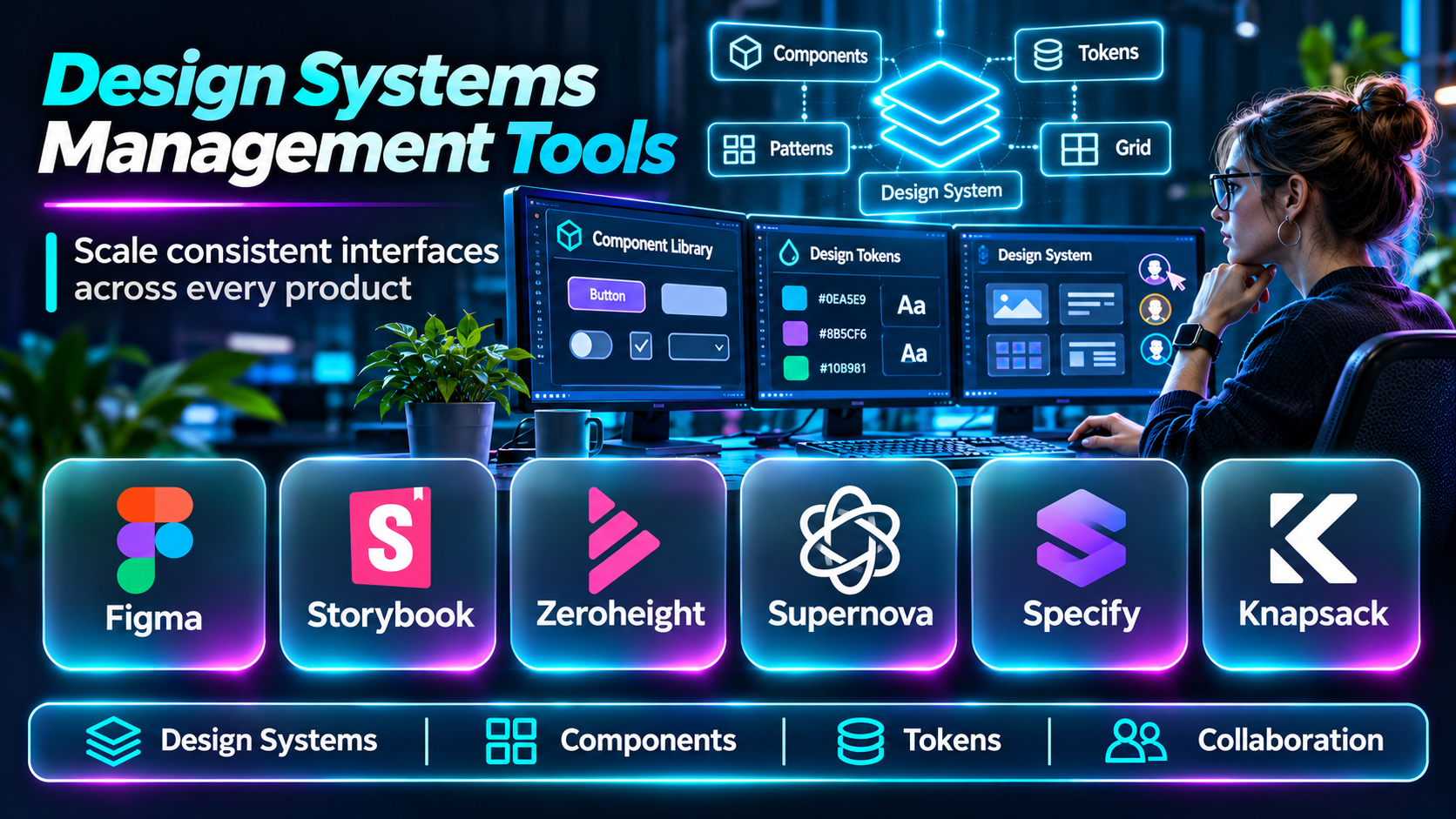
Design systems management tools help organizations define reusable interface components, document design standards, coordinate design and engineering teams, and manage changes across products.
A successful design system is more than a component library. It requires ownership, governance, documentation, contribution processes, and continuous maintenance.
This guide compares ten design systems management tools and explains how organizations can choose the right platform.
What Are Design Systems Management Tools?
Design systems management tools help organizations create, document, distribute, and maintain shared design foundations.
These foundations often include design tokens, typography, color palettes, spacing rules, component libraries, interaction patterns, accessibility guidance, and implementation documentation.
Some tools focus on visual design. Others specialize in documentation, code components, or collaboration between design and development.
Top 10 Design Systems Management Tools
1. Zeroheight
Short Description
Zeroheight is a design system documentation platform designed to help organizations publish and maintain design guidance.
It allows teams to organize component documentation, design principles, and usage instructions in a shared environment.
Its strength is making design systems understandable to designers, developers, and other stakeholders.
Key Features
- Design system documentation.
- Component guidelines.
- Design tool integrations.
- Documentation organization.
- Design token documentation.
- Team collaboration.
- Version-related workflows.
- Shared design system publishing.
Benefits
Creates a central reference for design standards and component usage.
Pros
- Documentation specialization.
- Useful design integrations.
- Supports cross-functional collaboration.
- Suitable for enterprise design systems.
Cons
- Not a complete design editor.
- Documentation requires maintenance.
- Commercial pricing applies.
Use Cases
Publishing design system guidelines and maintaining component documentation.
Best For: Design system teams prioritizing documentation.
2. Storybook
Short Description
Storybook is a development environment for building, testing, and documenting UI components in isolation.
It is particularly useful for code-based design systems where developers maintain reusable components.
Storybook helps engineering teams demonstrate component states and create documentation close to implementation.
Key Features
- Isolated component development.
- Component stories.
- Interactive documentation.
- UI testing integrations.
- Component state visualization.
- Framework support.
- Add-on ecosystem.
- Development workflow integration.
Benefits
Makes reusable UI components easier to develop, review, and maintain.
Pros
- Open-source ecosystem.
- Developer-oriented.
- Strong component workflows.
- Useful testing integrations.
Cons
- Requires engineering setup.
- Design governance needs complementary processes.
- Documentation quality depends on maintenance.
Use Cases
React component libraries and frontend design systems.
Best For: Engineering-led design systems.
3. Figma
Short Description
Figma is a collaborative interface design platform with features supporting shared component libraries and design systems.
Designers can create reusable components, manage variants, and organize styles and variables.
Its collaborative environment helps multiple teams work with shared design foundations.
Key Features
- Shared component libraries.
- Component variants.
- Design variables.
- Shared styles.
- Collaborative editing.
- Design prototyping.
- Developer handoff.
- Library management.
Benefits
Helps designers create consistent interfaces across products and teams.
Pros
- Widely adopted collaborative design environment.
- Strong component library support.
- Useful design variables.
- Supports design and developer collaboration.
Cons
- Code implementation remains separate.
- Large libraries require governance.
- Advanced organizational features may require paid plans.
Use Cases
Managing interface components and shared visual foundations.
Best For: Design-led product organizations.
4. Supernova
Short Description
Supernova is a design system platform that helps teams manage design documentation, tokens, and handoff workflows.
It connects design system foundations with technical implementation requirements.
Supernova is especially relevant when organizations need to manage design tokens across multiple products and platforms.
Key Features
- Design system documentation.
- Design token management.
- Token transformation workflows.
- Design tool integrations.
- Component documentation.
- Collaboration.
- Design-to-code workflows.
- Design system publishing.
Benefits
Supports coordination between visual design standards and implementation.
Pros
- Strong token-related capabilities.
- Design system specialization.
- Useful documentation.
- Supports cross-platform workflows.
Cons
- Requires implementation planning.
- Commercial investment.
- Complex systems need governance.
Use Cases
Managing tokens and documenting multi-platform design systems.
Best For: Organizations with mature design systems.
5. Knapsack
Short Description
Knapsack is a design system management platform focused on connecting design, code, and documentation.
It helps teams create shared environments for component guidance and design system collaboration.
Its approach is useful for organizations seeking stronger alignment between designers and developers.
Key Features
- Design system documentation.
- Component management.
- Design and code collaboration.
- Design token workflows.
- Shared component references.
- Governance support.
- Team workflows.
- Design system publishing.
Benefits
Helps reduce inconsistencies between documented design patterns and implemented components.
Pros
- Design system specialization.
- Cross-functional orientation.
- Useful component documentation.
- Supports governance.
Cons
- Commercial licensing.
- Setup requires coordination.
- Capabilities should be evaluated against existing tools.
Use Cases
Enterprise design system coordination and shared component documentation.
Best For: Cross-functional design system teams.
6. UXPin
Short Description
UXPin is an interface design and prototyping platform with capabilities supporting design systems and reusable components.
Its approach emphasizes interactive design and, in supported workflows, connections between design and coded components.
It can be useful when organizations want prototypes that closely reflect implementation behavior.
Key Features
- Reusable UI components.
- Interactive prototyping.
- Design system libraries.
- Component properties.
- Design collaboration.
- Code-connected component workflows.
- Design documentation support.
- Developer collaboration.
Benefits
Helps teams create consistent interactive prototypes using shared components.
Pros
- Interactive component focus.
- Useful design system workflows.
- Supports advanced prototyping.
- Relevant to design-engineering collaboration.
Cons
- Learning curve.
- Code-connected workflows require setup.
- Not a full code documentation replacement.
Use Cases
Designing interactive enterprise interfaces and component-based prototypes.
Best For: Teams needing advanced prototyping.
7. Specify
Short Description
Specify is a design token management platform that helps organizations organize and distribute design decisions across tools and codebases.
Its focus is on creating structured, reusable design data rather than serving as a complete interface editor.
It is useful for organizations managing multiple platforms or brands.
Key Features
- Design token management.
- Token synchronization.
- Structured design data.
- Token transformation.
- Design tool connections.
- Developer workflow integration.
- Multi-platform token delivery.
- Design foundation consistency.
Benefits
Reduces manual duplication of design values between teams and systems.
Pros
- Specialized token management.
- Supports design-to-code workflows.
- Useful for multi-platform products.
- Encourages consistent design foundations.
Cons
- Not a complete component documentation solution.
- Requires technical integration.
- Teams should verify current service availability and offerings.
Use Cases
Synchronizing colors, typography, and spacing across applications.
Best For: Design operations and frontend platform teams.
8. Chromatic
Short Description
Chromatic is a visual testing and component review platform closely associated with Storybook workflows.
It helps teams review UI component changes and detect unintended visual differences.
Although it is not a complete design system management solution, it supports quality assurance for code-based component libraries.
Key Features
- Visual regression testing.
- Storybook integration.
- Component review workflows.
- Visual change detection.
- Collaboration.
- CI integration.
- UI testing.
- Component quality reporting.
Benefits
Helps prevent visual regressions in shared components.
Pros
- Strong Storybook integration.
- Useful visual testing.
- Supports component review.
- Relevant to design system maintenance.
Cons
- Not a complete documentation platform.
- Visual baselines require management.
- Usage costs may increase with test volume.
Use Cases
Validating component library changes and preventing visual regressions.
Best For: Engineering teams maintaining UI libraries.
9. Backlight
Short Description
Backlight is a design system development platform oriented toward building and documenting component libraries.
It combines component development workflows with documentation and collaboration capabilities.
Its approach is relevant to teams seeking a unified environment for code-based design system work.
Key Features
- Component development.
- Design system documentation.
- Code-based workflows.
- Component previews.
- Team collaboration.
- Development integrations.
- Reusable library organization.
- Design system publishing.
Benefits
Supports structured development of reusable interface components.
Pros
- Code-oriented design systems.
- Component documentation.
- Developer collaboration.
- Useful reusable UI workflows.
Cons
- Product availability and support should be verified.
- Requires engineering expertise.
- May overlap with existing tooling.
Use Cases
Developing and documenting frontend component libraries.
Best For: Developer-led design system projects.
10. Frontify
Short Description
Frontify is a brand management platform that also supports design guidelines, reusable assets, and design system documentation.
It is especially relevant to organizations where interface consistency must align with broader brand standards.
Its strength lies in connecting brand governance with shared digital design resources.
Key Features
- Brand guidelines.
- Design documentation.
- Shared digital assets.
- Design system guidance.
- Team collaboration.
- Brand governance.
- Asset organization.
- Shared publishing workflows.
Benefits
Helps organizations coordinate brand identity and interface design standards.
Pros
- Strong brand governance.
- Centralized guidelines.
- Useful enterprise collaboration.
- Supports shared assets.
Cons
- Less specialized for code component development.
- Commercial licensing.
- Engineering workflows may require additional tools.
Use Cases
Managing brand guidelines and design standards across departments.
Best For: Brand-led enterprise design teams.
Design Systems Management Tools Comparison Table
| Tool | Main Strength | Best For |
|---|---|---|
| Zeroheight | Documentation | Design system teams |
| Storybook | Code components | Developers |
| Figma | Design libraries | Designers |
| Supernova | Tokens and documentation | Mature design systems |
| Knapsack | Design-code collaboration | Enterprise teams |
| UXPin | Interactive components | Product designers |
| Specify | Token management | Design operations |
| Chromatic | Visual regression | Frontend engineers |
| Backlight | Component development | Engineering teams |
| Frontify | Brand governance | Enterprise brand teams |
How to Choose Design Systems Management Software
Identify the Main Problem
Choose documentation software if teams cannot find guidance. Choose token management if values are inconsistent across platforms. Choose component tooling if reusable code is difficult to maintain.
Evaluate Design and Code Integration
A strong design system needs alignment between visual specifications and implemented components.
Establish Governance
Define component ownership, contribution processes, versioning rules, and review responsibilities.
Plan Accessibility
Document accessibility requirements for reusable components, including keyboard behavior, semantic structure, and interaction states.
Consider Scale
A small team may manage its design system with Figma and Storybook. Larger organizations may need dedicated documentation, token management, and governance platforms.
Best Design Systems Management Tools by User Type
| User Type | Recommended Tool |
|---|---|
| Design system documentation team | Zeroheight |
| Frontend engineering team | Storybook |
| Product design organization | Figma |
| Multi-platform design team | Supernova |
| Enterprise design operations | Knapsack |
| Interactive prototyping team | UXPin |
| Token-focused team | Specify |
| Component QA team | Chromatic |
Practical Example: Building a Multi-product Design System
Step 1: Audit existing interfaces and identify repeated patterns.
Step 2: Define shared colors, typography, spacing, and interaction principles.
Step 3: Create design tokens.
Step 4: Build reusable design components.
Step 5: Implement matching code components.
Step 6: Document usage, accessibility, and component states.
Step 7: Add component testing and visual regression checks.
Step 8: Establish a contribution and review process.
Step 9: Publish versioned guidance.
Step 10: Measure adoption and maintain the system.
Frequently Asked Questions
1. What is a design system?
A collection of reusable design foundations, components, patterns, and guidance.
2. What is a design system management tool?
Software that helps teams maintain and distribute design system resources.
3. What are design tokens?
Structured values representing design decisions such as colors and spacing.
4. What is a component library?
A collection of reusable interface elements.
5. Is Figma a design system tool?
Yes, it supports shared design libraries and reusable components.
6. What is Storybook used for?
Developing, documenting, and testing UI components.
7. What is design system governance?
The processes used to maintain quality, ownership, and consistency.
8. Can design systems improve accessibility?
Yes, when reusable components incorporate tested accessibility requirements.
9. What is visual regression testing?
Testing that detects unintended changes in interface appearance.
10. Do small teams need a design system?
They can benefit from lightweight shared components and standards.
11. Can one design system support multiple products?
Yes, with appropriate shared foundations and product-specific variations.
12. What is design-to-code synchronization?
Keeping design specifications and implementation values aligned.
13. How should design systems be versioned?
Use clear change management and release practices appropriate to consumers.
14. Who should own a design system?
Typically a cross-functional group involving design and engineering.
15. Which management tool is best?
Choose according to documentation, component development, tokens, governance, and integration needs.
Final Thoughts
Design systems management tools help organizations maintain consistent digital experiences. Figma supports visual libraries, Storybook enables code component development, and Zeroheight provides centralized documentation.
Supernova, Knapsack, and Specify address more specialized coordination needs, while Chromatic helps protect component quality.
The best design system is one that teams can understand, adopt, and maintain over time.
